Creating an infographic from scratch
Today I bring an analysis of what I learned about creating infographics in the Infografía antibostezos course (Domestika). It was a very good experience that brought me many lessons, thanks to the professors from the Relaja el Coco studio. And, although I had already done several infographics, there were still many aspects that I didn’t usually take into account.
I detail the proposals sent and the lessons learned from each one, points that I could improve thanks to the extensive feedback with detailed explanations from the teachers.
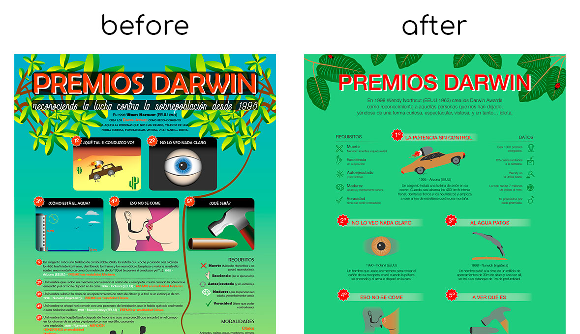
First proposal (much to improve)
- Excess of color: too many different colors and abuse of dark boxes, which creates a feeling of stain.
- Bad structure (sometimes void), which reinforces an (unwanted) feeling of chaos. Here would also come the fact that the elements (image and text) are very crowded and without an order.
- Inconsistencies in the drawings: mix of icons only linear, only filled and both types. It also mixes hyperrealistic images (like the eye or the hammer) with other very conceptual ones (like the car). On the other hand, some are shown from very close (like the eye of vignette 2) and others from far away (like the one that is thrown into the water of vignette 3). Regardless of the subject motifs: mix of shadows, highlights, gradients and flat design.
Second proposal (the structure)
- Structure: on the one hand, I chose to give greater importance to the first prize, leaving it at the top of the infographic and alone. I also restructured the arrangement of the texts, so that it is clearer to which vignette each corresponds, and thus reduce the feeling of chaos.
Foot: another change was to make the illustration of the foot smaller and take it further down, since it made less space and prevented from giving air to the infographic (which brings more clarity).
Third proposal (drawings, structure and color)
- Drawings: In the first place I opted for more realistic representations and modified two that were very conceptual (the car and the man who jumped into the water) so that they were more realistic and therefore not very different from the other three. I also removed the shines like those of the engine of the first vignette and the hammer of the fifth and removed the liana, as there were no boxes in each vignette, it would have to hang over the contents, making reading difficult. On the other hand, as for the “Requirements” and “Data” icons, I modified them to make them all linear.
- The structure differs somewhat from the one proposed in the second proposal: I restructured the layout of the texts, placing the titles above the corresponding bullet point, and the descriptions of each one below. In addition, I deleted the “Modalities” section, as it was not essential and brought confusion.
- As for the color, I kept using a color palette with 6 (plus white), and removed the dark background boxes of the titles (general and bullet points).
Fourth and last proposal (polishing details)
- Drawings: The only change I made was that of the headboard drawing, replacing the sheets with more subtle ones that did not detract too much from the rest of the infographic.
- Structure: The change in the headline drawing allowed me to modify the layout of the introductory text, being able to send it upper and letting therefore more white space before the content.
- Color: I continued using a 6-color color palette (plus white), but with some variations that make the content better understood. Namely: the background is of a uniform color instead of gradient, which makes the headlines stand out more.
Result: from a chaotic to a clear infographic
Seeing the two infographics together, from the first proposal to the final one, you can see a great change for the better, in which all the information is better understood, by representing it in a clearer way.


